Key Points
The key to moving to a more effective and robust cybersecurity program is understanding how your progress has improved over time. But deciding how to measure your performance and what to report isn’t always easy – or available. Especially with an ever-expanding attack surface.
Even though this can be hard, security leaders are under pressure to demonstrate their value and the ROI of security products beyond just reducing risk. They also need to demonstrate how their security plans align with the goals of their organization – which the right metrics can help achieve.
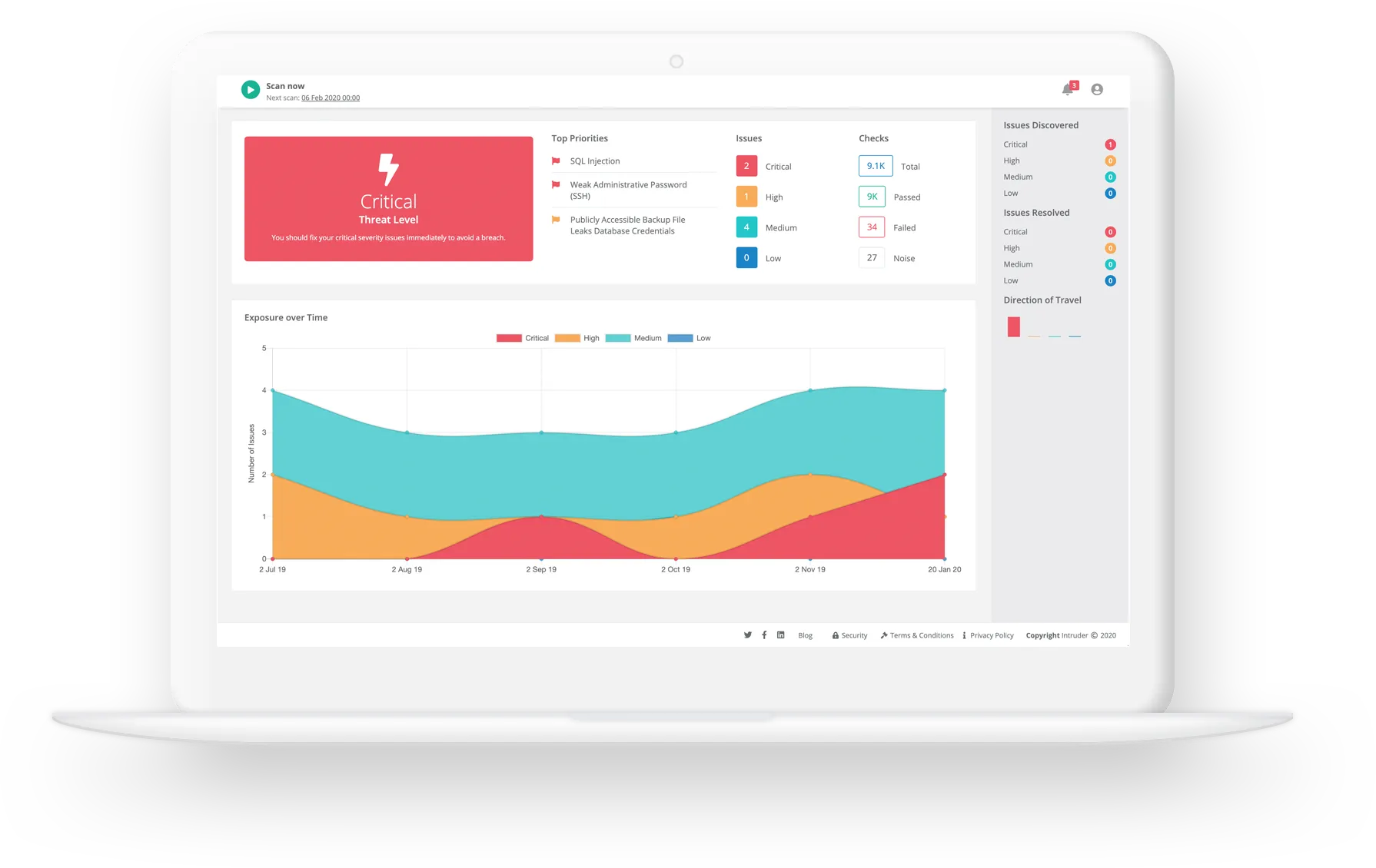
At Intruder, we understand this better than anyone. Our reporting has always focused on the results of your scans and the current state of your attack surface. And while this was ideal for prioritizing immediate work, it made it harder to see your progress over time.
In today’s ever changing cyber security landscape, you need more granular and more relevant metrics. You need to know and show how long it’s taking your team to fix. So, we’ve introduced a much more informative, intuitive and useful analytics page that shows your progress over time.
What’s in it for you?
- See how you’re fixing vulnerabilities over time compared to previous periods
- Demonstrate to auditors and customers that you're scanning for new threats
- Quantify the number of threats and time to fix to the board and management
- Track you team’s progress and performance so you can allocate resource
So, what’s new?
Unlike your dashboard which is a static snapshot of your security posture now, the new analytics tab tracks your exposure over time and shows how well your team have performed in any given date range. You can now compare different time periods – for example you can choose to look at the last 30 days compared to the previous 30 days.
The new analytics page shows these metrics organized into three sections - Issues, Monitor Progress and Attack Surface:
- New issues
- Open issues
- Fixed issues
- Average time to fix
- Emerging threat scans
- Scan frequency
- Cyber hygiene score
- Most vulnerable targets
- New services
- Scanned targets

Let’s dive in to each and see how you can use these new analytics to accurately measure success and the progress of your vulnerability management efforts...
1. Issues
This is the point from a vulnerability going public, to having scanned all targets and detecting any issues. Essentially, how quickly are vulnerabilities being detected across your attack surface, so you can fix them and reduce the window of opportunity for an attacker.
What does this mean in practice? If your attack surface is increasing, you may find that it takes you longer to scan everything comprehensively, and your mean time to detect may increase as well. Conversely, if your mean time to detect stays flat or goes down, you're using your resources effectively. If you start to see the opposite, you should ask yourself why it’s taking longer to detect things? And if the answer is the attack surface has ballooned, maybe you need to invest more in your tooling and security team.
Widgets explained
- Open issues: the number of issues that were open on the last day of the selected time period so you can spot trends. For example: if you have more open issues this quarter than the last, your team might be under-resourced; if you have fewer this month than you did last month, whatever you have in place appears to be working well.
- New issues: the total number of issues that were detected during the time period specified and not present in the previous period. Again, this is to help you spot trends. If the number increases, it might be worth exploring whether your attack surface has expanded (perhaps unintentionally) or whether there is a shortfall in your patch management program.
- Fixed issues: the total number of remediated active issues, either newly found or existing, so you can monitor your performance when it comes to remediation and make sure you're prioritizing based on severity.
- Days to fix: the average number of days between an occurrence being detected to it being fixed – grouped by severity. Similar to above, it’s designed to help you track performance and understand if you're prioritizing the right vulnerabilities.
Explore the new analytics in our interactive demo below.
2. Monitor progress
Prioritization – or intelligent results – is important to help you decide what to fix first, because of its potential impact on your business. We filter out the noise and help reduce false positives, which is a key metric to track because once you reduce the amount of noise you can circle back and focus on the most important metric – the average time to fix.
Why is this important? Because when you do find an issue, you want to be able to fix it as quickly as possible. Intruder interprets the output from a number of industry-leading vulnerability scanners and prioritizes the results according to context, so you can save time and focus on what really matters.
Widgets explained
- Emerging threats: the number of emerging threat checks which have been run on your attack surface, a breakdown of the severity of the scans, and whether they passed/failed so you can see whether you’re consistently failing ETS checks, to help you see your performance and whether it's improving or worsening.
- Days between scans: the total number of assessments run and the average (mean) interval between them to help you see how often you're scanning your attack surface (the more frequent the better!).
- Cyber hygiene score: a high-touch snapshot of your commitment to protecting your attack surface over time.
3. Attack surface
In this section, you can see the percentage of assets that are protected across your attack surface, discovered or undiscovered. As you team spins up new apps, our vulnerability scanner and CloudBot check when a new service is exposed, so you can prevent data from becoming inadvertently exposed. CloudBot monitors your cloud systems for changes, finding new assets, and synchronizing your IPs or hostnames with your integrations.
Why is this important? Your attack surface will inevitably evolve over time, from open ports to spinning up new cloud instances, you need to monitor these changes to minimize your exposure. That's where our attack surface discovery comes in.
Widgets explained
- Most vulnerable targets: the targets with the most un-remediated occurrences at the end of the selected time period, this helps you understand which target(s) need immediate attention, so you can prioritize resource.
- New services: the number of new services discovered during the time period specified to help you understand if your attack surface is growing (whether intentionally or not).
- Scanned targets: the total number of targets that were scanned during a set period, be it one-off scans; scheduled scans; remediations scans or Emerging Threat Scans so you can see how much of your attack surface is being actively scanned by Intruder.
The success analytics tab feature is available to all users with a Pro, Premium or Vanguard plan. When you visit the analytics page for the first time, you'll see a survey to gather your feedback on this new feature. Please take a minute to tell us what you think. We look forward to hearing your feedback!


Get our latest news, research, and expert advice, straight to your inbox
.jpg)


![Top Dynamic Application Security Testing (DAST) tools [2024]](https://assets-global.website-files.com/61dd9339d05701829d0b3241/63a1911637e85e9bd7752961_Web%20app%20security%20testing%20thumbnail.jpg)